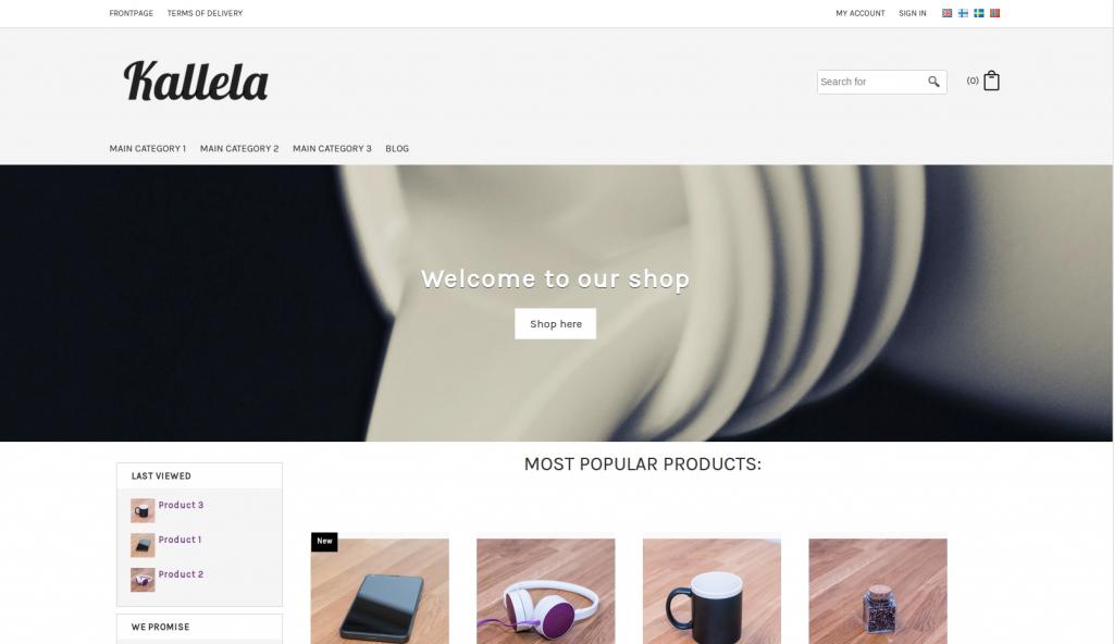
The "Kallela" theme is a stylish and responsive theme with a column on the left. You can download it and start using it in your shop by following the instructions below. Once the theme has been imported in the shop it works best if not too many changes are made afterwards. If you want to change and build your own theme we recommend to instead use one of the other ready made themes from the settings as a base and build on from that.
In the desktop view the Kallela theme has a column on the left. From the advanced design settings it is possible to add different elements in the left column, such as last viewed products or a text box or some similar element. In the header area, where the logo, search bar and basket elements are located we recommend to not add new elements or make any changes except for adding your own logo in the logo element instead of the example logo. Even though it looks like there is a lot of space for new elements in the header from a bigger screen, there is a big risk that new elements wouldn't show very well on a mobile screen and that the theme would no longer be responsive.

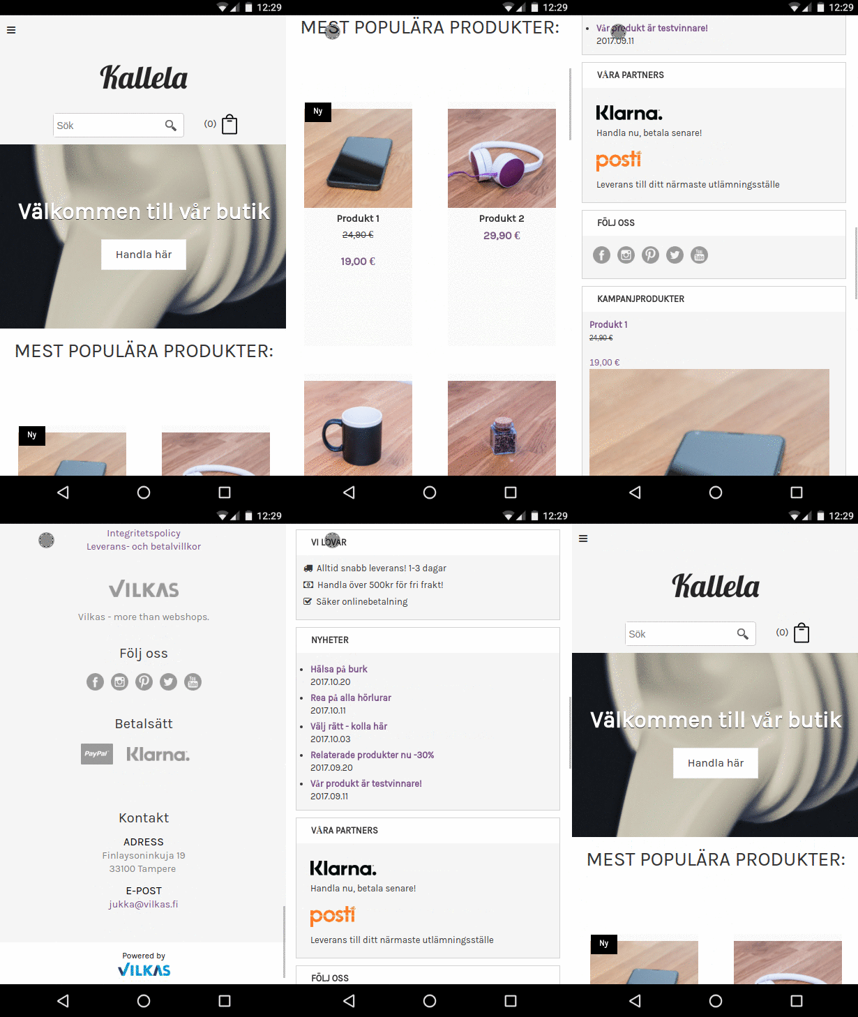
When this theme is viewed from a mobile screen some elements are changed, for example the menu is moved to a hamburger button on the top left and the column on the left is shown below the content of the home page.


You can add the theme to your shop by following these steps.
1) Download the theme to your computer 2) In the shop administration on the Design > My themes page click on the "Import theme" button at the bottom of the page and choose the theme.
3) Tick the "Overwrite the start page during import" if you want the theme's example content to be imported to the shop. Please note that it then overwrites the existing content on the home page. (If needed, copy the existing content as a backup copy from the Content/categories > Datasheet view > General page).
4) When the theme has been imported to the shop it will appear at the bottom of the list on the Design > My themes page. From there you can preview, edit and activate the theme to make it the active theme used in the shop.
Necessary settings
Here we list the settings for pages and products that are necessary for this theme. The theme has been designed to work with specific settings and wouldn't necessarily look as good using other settings.
1) On the Content/categories > Datasheet view > Layout page you should change the home page setting for texts so that it uses the setting with one picture and three text fields:

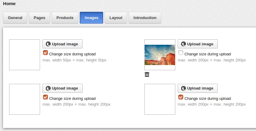
2) On the Content/categories > Datasheet view > Images page the second image field is the field that is used for the large picture on the home page and you can here upload your own image. You first untick the box for "Change size during upload" to avoid the image size being scaled during upload. The recommended size for this picture is 1500x500px.

3) The home page content in the field "Long description" is used as the text that shows on top of the picture. With the format "Heading 2" the text will be on the banner picture in the same format as in the example and a link that is added in "Long description" will show as a button on the picture. Content added to the "Long description (2)" field will show just below the banner picture.
I edited the theme and now it's not responsive anymore
If you want to make changes to the theme elements we recommend that you first save a backup copy of the theme on the Design > My themes page. If the changes would then break the responsivity you can easily go back to the backup copy. You can also always import the theme again to start from the beginning.
I don't know how! I don't have time! = Don't worry!
If you feel it is too difficult or takes too much time to start using this theme you can always order the implementation of the theme as an extra service from us at 295€ (excl. VAT). The service includes the implementation of the theme in your shop as well as adding your logo and changing the colours to match your image. Bigger changes are not included in the service and if bigger changes are needed they should be agreed on separately.
Limitations and possibilities for further editing
If you edit the different areas of the theme too much the risk is that it will cause problems on how the theme is adapted, the responsivity on smaller screens. Before starting to make changes it is therefore a good idea to make a backup copy of the theme on the Design > My themes page so that you can easily go back if needed.
Header 1: The upper header has been split and the left side is designed for links. The right side is designed for login and account elements plus the language selection. On a mobile screen the right side will automatically be shown below the products and the left side will be completely hidden. We recommend not adding any new elements in this header since it's not built to support more elements.
Header 2: The second header is built for the logo, the search field and the basket. We recommend not adding any new elements in this header since it's not built to support more elements. The basket symbol is hard coded for the theme and can therefore not be changed. If you need a white basket symbol for the theme, please contact our support team or add the below HTML code in the Head area:
<style>
html body .GeneralLayout .HorizontalNavBar .BasketBox .fa-shopping-cart
{ filter: invert(100%) brightness(200%);}
</style>
Top: The top area is designed only for the mega menu element. The element background colours, the font colours, sizes etc. can be changed, but the theme is not built to support the mega menu being moved or changed to another element. We recommend not adding any new elements in this top area. On a mobile screen the top area is moved all the way to the top and the mega menu is automatically changed to a hamburger button.
Left: The left column is built with several HTML elements where you can add links, pictures etc. and also change the ones that are already there. In the left column you can add more elements, but remember that all elements might not be responsive, which means they might not scale correctly on all types of screens. On a mobile screen the left column is automatically moved to show below the products.
Bottom: In the bottom area there is by default no content, but you can here add for example text, links or pictures.
Footer: The footer is spilt into four columns, 3 HTML elements and 1 address element. If you want you can add links or icons in the content of the HTML elements and change or remove the example content. We recommend not adding any new elements in the footer since it's not built to support more elements.
